skip to main |
skip to sidebar
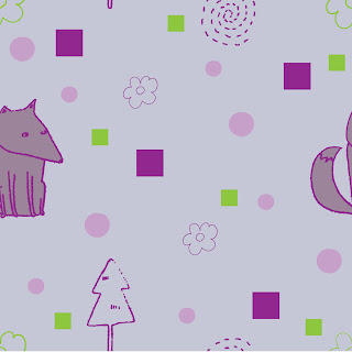
This is my first attempt at making a pattern using illustrator. this is the square that I can now make a repeating pattern out of. I am not overly happy with the outcome, as the overall look is a bit off and the colour scheme is a bit sickly! But I am happy that I now know I can make it patterns. I want to make a pattern for the end pages of my book, as this will be more interesting than a blank, coloured page, or found pattern or texture. Also, it will show that I can do things like this, and use illustrator.

 i think the collaged birds work much better (especially since there are no dodgy pen lines now!) the contrast in perspectives between the two pages also makes the pages work better together.
I have spent pretty much all day on this layout, it has been driving me mad. I want the colour scheme to work better... and the lines are just not looking good enough. I think I'm going to make the birds in collage like the other characters. 
 I think the bird character (little bird) needs to come down a bit on the page as it is at the same level as the birds in flight on the other page, which looks to me a bit bland.
So it seems that I'm not very good at moving on from an image, even though I know I can come back to it later. Oh well, I guess if I can get this one right then the others can follow :)Im trying to use more dramatic colour schemes, as I tend to stick to safe colours, which end up being really bland and samey.


