skip to main |
skip to sidebar
Here is a design for my front cover for my little book. I cut out the letters and scanned them in on the patterned paper. This pattern is used throughout the book, so works quite nicely to link the front cover and the rest of the book. Ive included the little bird (main character) on the front cover, because I think in a childrens book, it is important to have at least one character on the cover to make the child want to learn more about this character.

For the back cover, I have continued the pattern, including some of the rough edges of the paper, and just included some elements of the environment in which the story is set. I quite like this idea. This would also work well for the Title page, as it is "setting the scene".

my mock up or draft book, has just arrived. Thank goodness for draft books! Apparently I didnt put in a single page at the start, so the book started with page 1 on the first page (sounds obvious) but page 1 is part of page 2 and they need to be a double page spread, so the whole book full of pages partnered with the wrong page. Thats ok though, because it is a mock book. My main reason for ordering one was to check things like that, and to check how the colours come out etc. The blue sky has come out darker than expected, so might change that. Although the dark sky is ok for some of the pages. I like how alot of it has come out, and it has shown up some things that I need to change, so the book has done its job.  (Where I went wrong!
)

 I like how the end pages have come out and how they look as part of the book.
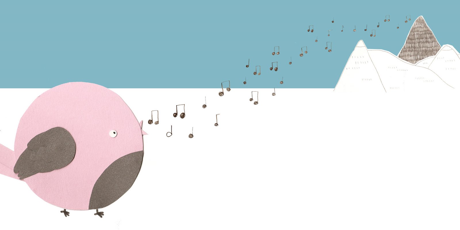
 Following advice given by Salvatore last week, I have thought about using weather to build atmosphere and mood within each page. In this page, the little bird is sad and alone, so I have changed the background so it is darker and greyer, and I have reduced the colour saturation of the clouds to make them grey, and I have added some rain. This will all help reflect the mood of the main character to be gloomy and sad.
Here is another page size that I have tried out. This format is much thinner than the original. It looks ok, but ever so slightly squished looking, but that might just be because I am used to seeing these images in a wider format.


Well, I ordered my mock book on lulu yesterday, and in doing so, realised that I have chosen a page size that I wont be able to get bound in the type of binding that I want. I want to get my book bound using the 'perfect bound' method, and I realised I can only get that with my current page size if I have over 68 pages. I only need 32 pages. So! I ordered my mock book anyway, as I need to see how the colours come out etc. but now I need to change my page sizes to a size which can use the binding method that I want. Can' t belive I've been so stupid. I thought I had checked everything like that when I chose the page size. Oh well, I just need to get over it and get on with it. I have had a look at the other possible page sizes, and alot of them, I feel are too tall and narrow, where as I prefer wider books. (thats why I liked my original page size as it was tall but wider than normal.) I have had a look at what my images would look like using square pages, and I think they work quite well. I might try another size aswell just to have a comparison. I have been working on the individual scened pages too, after having a tutorial with Salvatore, who gave me some brilliant advice on how to handle these pages.


Over half way through the pages now. They are getting easier to do as I feel a bit more confident with the layouts and now I have a defined style and colour scheme and I feel I can have a bit more fun with them.
 Need to change the layout of this one I think. The two speech bubbles look awkward, or just not right. Think they need to be at much different heights, and they need to look more different from one another. (I know what I mean)
Had our critiques yesterday with the tutors and the class, was really lovely to see how everyone is getting on with their EMPs. Was good to show my work to people who hadnt seen it yet, and was good to get some feedback, as was getting to the point where you are so familiar with the images, you start to kind of lose sight of whats good and whats not. Luckily, I am still going along the right path and my images were well recieved.
It was suggested that I look at certain pages where the two pages are two images (rather than one image over a double page spread), and some of the backgrounds of these type of pages are quite similar that it might confuse the images, so I need to look into ways of breaking the two images up so they can sit happily next to eachother, but not get confused as one. One way of doing this is by using a white border around one of the pages to break it away from the other page. I have tried this here:
 It looks ok, but I would like to look into more ways of doing this. Maybe a more subtle or interesting way?
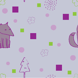
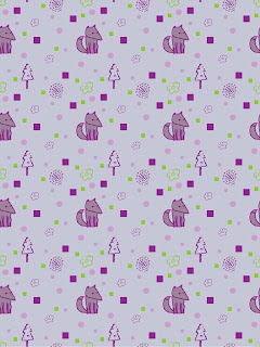
This is my first attempt at making a pattern using illustrator. this is the square that I can now make a repeating pattern out of. I am not overly happy with the outcome, as the overall look is a bit off and the colour scheme is a bit sickly! But I am happy that I now know I can make it patterns. I want to make a pattern for the end pages of my book, as this will be more interesting than a blank, coloured page, or found pattern or texture. Also, it will show that I can do things like this, and use illustrator.

 i think the collaged birds work much better (especially since there are no dodgy pen lines now!) the contrast in perspectives between the two pages also makes the pages work better together.


 (Where I went wrong!)


 Need to change the layout of this one I think. The two speech bubbles look awkward, or just not right. Think they need to be at much different heights, and they need to look more different from one another. (I know what I mean)


 i think the collaged birds work much better (especially since there are no dodgy pen lines now!) the contrast in perspectives between the two pages also makes the pages work better together.


