Monday 17 May 2010

website

website is finally working. Made it a few weeks ago and thought it was working, but it wasnt so finally got it working. yay.

its very basic at the moment, and does something strange for the first few clicks, but then it sorts itself out. I will be sorting that out and also adding more work onto it soon. 


address is.... www.holliemcmanus.co.uk

Monday 10 May 2010

evaluation

Evaluation, Employment and Enterprise

I started the EMP unit knowing that I wanted to create a children’s picture book. In the Negotiated Practice unit I felt like I had finally found my own style that I liked working in and that was unique to me. The style is a mix of drawn and printed images, with found papers and patterns and digital elements such as flat colour to contrast with the patterns and textures. I think this style evolved from my love of collage and found papers and realising that full collage might not be the most economical way of creating images in the industry and each element of each image takes time to create and get right. Mixing collage, textures and handmade elements with the digital side of things, meant that images can be put together quicker and they are easier to change if needed, whereas if you need to change a bit of a collage, you need to start all over again! This means that I can complete illustrations in a good time which will mean I am more employable in the long run because I will be able to get commissions done within deadlines.
I knew that in EMP I wanted to push this style further. I wasn’t sure how I was going to do this so I started by playing with different media while I was deciding on a story to illustrate. I originally wanted to illustrate an old folk story that hadn’t been widely illustrated before because I wasn’t sure I would be able to write a strong enough story, but in my search I found that most of them were not suitable for young children or they just didn’t inspire me. I decided to try writing my own story. I tried a few different ideas, but decided to use ‘The Little Bird’ which is inspired by a little boy I know who suffers from Down’s syndrome. I am always so impressed that although he is obviously different from the other children and struggles with certain things, he has found that he is brilliant at some things (for example, he is quite the comedian!)
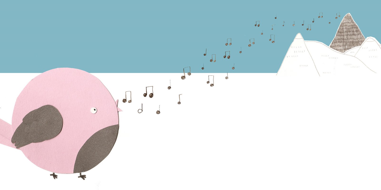
My story is about a little bird who struggles with coming to terms with her differences; she cannot fly like the other birds, so gets teased and she ends up feeling terrible, lonely and runs away. She meets some other animals who all have struggled with their differences, but realised that although they are not very good at one thing, they can be amazing at something else, meaning that being different doesn’t have to be a bad thing. I thought this story could inspire children to not focus on what they can’t do but focus and embrace what they can do. I like stories which not only look good and sound good but that have a meaning and a lesson to tell, because then children can be learning things without being lectured or preached to.
Once I had my story written out, I then started storyboarding it, planning how the story would look, how each page would reflect the words and how each page would work with its neighbours. I think it is important not only that each page looks good as a single image, but also that it works well with the previous and next pages. You can create a lot of tension with a calm page and then a big bold one when you turn over for example. I haven’t had a great deal of experience with storyboarding, but in a few tutorials I was told that I had a good eye for layout and how a page works, so that was really confidence building and helped me feel confident enough to create more interesting and exciting pages. I then started working on my characters. I started by drawing them, in different ways, different styles and in different media. I quite liked the style of one of the characters but felt it didn’t quite feel right in the medium it was done in, so I remembered that I wanted to push my collage/digital style further, so I tried the characters in card with layers of card creating depth, and found that the characters just suited being made in this way. They had a certain delicacy to them, which made them feel special. I looked back over my negotiated practice work to see what I especially liked about the images, and I really liked the mono-printed elements and how the roughness and handmade feel of them contrasted with the digital feel of the background, so decided to incorporate mono-printed elements in my EMP images.
A while ago a tutor told me that elements of my work reminded them of Sara Fanelli’s illustrations and that I should look at her work. Since discovering her, she has remained one of my favourite illustrators. Back then I hadn’t found my own style, but elements of my work were standing out and I knew I liked those bits but I don’t think I could work out how to develop those bits into a style or method of working because I wasn’t confident enough in my work. My work has developed a lot within the last few units, and I have become more confident in my own way of working because I know that it is different, unique and tries to push illustration. Still today I can familiarities in my own work and the work of Sara Fanelli, as my tutor did back then. She creates children’s books and adult books, using collage. The collages are built up with photographs, patterns and pencil drawings. She creates the collages by hand and then scans them in and adds the digital text (if any) afterwards. My style is similar in the fact that I create children’s books using collage, but I have tried to push the materials that I use such as patterns, textures, cut outs and mono-print and I also use the computer a lot more in my images. An element of Sara Fanelli’s work which I would like to try within my own work is the photograph elements, although if I do try this I think I would have to use it sparingly so not to ruin the unique and ‘cute’ look of my work. I think that is where the two styles differ; Sara Fanelli’s illustrations are more stylish and slightly abstract and surreal, whereas my style is more ‘cute’. Although I realise now that some elements could be seen as surreal. I use cute, simple characters so the younger children can relate to the characters and the whole image is quite easy for the younger children to read. I think using cute-ness can be a really helpful tool for children’s illustrators when illustrating books for younger children. Sara Fanelli’s work doesn’t tend to use cute as a tool but she uses more abstract characters and environments which I find are beautiful and experimental for a children’s book, but they seem to work. I think children’s books in general could push the boundaries of illustration a lot more, as children also appreciate illustration, and although more traditional methods of illustration can be beautiful, I think it is nice to see some children’s books pushing the illustration boundaries. I found an interview in which Sara Fanelli agrees with this point when talking about her illustrations; “I would hope that they can appeal to everyone. I have noticed that sometimes adults have a preconceived idea of what children might like and this is not necessarily correct. For instance, though some adults might consider collage as a "sophisticated" technique, in my experience, also visiting several schools and doing workshops with children, this is one of the most basic and easy technique for children to relate to.” I think this is refreshing to hear from an illustrator, because many children’s illustrators are too wary to try out new techniques because they think children won’t be able to read the images as well as the more realistic or simple illustrations.
What I also like about Fanelli’s work is her use of layout. Sometimes she doesn’t use a realistic background or environment, and uses just a pattern or negative space and lets the characters find themselves in various places on the page, and not necessarily in a realistic space in relation to the other characters or page elements. I think this is really interesting and brave, as it can be hard to get right. I think this particular use of layout works best on the busier pages. I did try this style of layout in Negotiated practice unit, but couldn’t get it to work quite as well as this. Fanelli’s use of the surreal in her work reflects her outlook on the world; “To me the world is surreal and I find its absurdities and surprises make it worth coping with all the rest. There is also an element of playfulness in the surreal side of things that is equally fundamental, for me, in order to live.” Fanelli, S.
During this unit I have been thinking about what I might like to do when I finish this course. Ultimately I would love to be illustrating children’s books, and I think I would like to do some editorial illustration too, as this seems quite exciting, and I like the idea of having a new issue to illustrate each week. My dream would definitely be to illustrate children’s books; either my own stories or a story that is in need of an illustrator. To realise this dream I will be contacting a number of children’s books publishers with some examples of my children's illustration work. I will be taking the advice which I have gained over the course of this unit, of how to get your work to publishers and editors. During this unit, I realised that I had not had an awful lot of experience in the design world, only a few pieces which I have designed for free, so I decided to do something which would enhance my CV and give me experience of working in an office environment, as part of a team, and in a design environment. Although working as a children’s book illustrator generally involves working individually in your own studio, I wanted to get some work experience which would allow me to gain confidence. I contacted a magazine which I read regularly called Horse. It is a monthly magazine which is all about riding, horse care and all things equestrian. I thought this would be a good place for me to start as I have a strong interest in the magazines topic and design, (I feel that Horse is the best designed out of all the equine magazines) so thought I would see how my two strongest interests could work together. Obviously going into a magazine office I thought I might be mainly stuck doing admin work or watching the designers at best, but the whole team were really supportive and gave me a whole range of tasks, which varied from researching for articles, writing, organising the image database and even choosing images for articles. I found all the tasks really interesting and even though some of them didn’t relate directly to illustration, they all helped in some way to my confidence and understanding of how a magazine and design office works. I was lucky to be able to sit with the design team and watch them working on the layouts for the pages and asked them questions and even got the chance to show them my work which they said they will keep in mind as they occasionally commission illustrators. At the end of the week, the editor, Lisa Reich, gave me some wonderful comments, saying that I was diligent, used my initiative and said that she was happy to let me get on with things without supervision. She also said that I could go back another time to get more experience with the design of the magazine, so I will definitely be taking up her offer in the near future. I also had a challenge which was to phone to gain research about a story which the editor had been told about but didn’t have the details. This really gave me a confidence boost on calling people, which I will have to do a lot of when phoning potential clients about commissions.
To help me start in the industry of illustration and design, I have created my own website, set up and updated a blog for many months and designed some business cards which I will be giving to as many people as possible, so I can get my work to as many people as possible. I will also be putting together a mail out pack, which I will send to publishers and editors with a selection of my work and my contact details. I have also been thinking about how else my work could be used and decided to get my pattern which I designed for the end pages of The Little Bird, printed onto fabric. This will allow me to create products such as pillow covers, tote bags and tea towels from my work which I could sell to boost my income. To make sure my work stays current and fresh, I will continue to try and push my style further and develop as an illustrator even after I finish this course. I think there is nothing worse than a stale portfolio, so I will continue to make images and update my portfolio often to show what I can do. I will make sure my portfolio has a variety of final outcomes and developments showing that I can find different solutions to different briefs but always in keeping with my own style. I think is important to show you can work in different media and not always end up with the same solution, as some illustrators and designers do, and this makes their portfolios look really bland and samey.

Thursday 29 April 2010

business card research

I like these.

Business Card Designs

Business Card Designs

Business Card Designs

Business Card Designs 


 But for now mine look like this:

Monday 26 April 2010

Lecture notes - Steve Gordon (careers advisor)

Today we had a lecture with Steve Gordon about Freelancing. careers service - guidance. available for 2 years after graduation.

Freelancing - is it right for me?


Qualities required
  • Ability to cope with uncertainty e.g sickness and holiday periods not allowed for
  • Being self motivated
  • Superior networking skills
  • Self marketing skills
  • Belief
  • Self Discipline
  • Energy
What do you need?
  • money! how much?
  • essential equipment - materials, tools, software
  • Premises
  • Transport
  • add them all up and work out how much I need to earn
Freelancing option - Sole Trader
  • simplest structure. No registration costs etc.
  • Register as self employed with HMRC
  • Personally liable for any debts
  • All profits to you
  • Also need to need to pay fixed rate class 2 and 4 national insurance contributions on profits
  • Self assessment tax return
  • VAT - if turnover over £64000 <--- i wish!
Record Keeping
  • need to keep a record of all transactions incoming and outgoing to satisfy inland revenue - materials, business costs
  • Invoices and reciepts need to be kept
  • date, reference, who, how much and what <-- keep organised!
  • make sure all reciepts and transactions match spreadsheet - make spreadsheet to keep organised.
    (see example below)
  • Bank statements - need to keep for 5 years - evidence of payments.

(this is an example of how to keep records. not illustration related, but same structure.)


HAVE A CONTRACT!!

A contract protects you if things go wrong. Essentials:
  • Fees - what you are paid for? how much?
  • How is the contract evaluated at the end of the project?
  • Obligations of employer
  • Copyright issues - who owns it?
  • Expenses, payment and invoicing
  • other considerations: legal, health and safety, illness, disputes, timescales, insurance
  • contract details
  • terms of service
  • deadlines
  • signed by both parties
good links:


Getting Work
  • agents take % of fee - find you work
  • AOI sell lists of editorial clients
  • Online agency search. e.g Advocate Art
  • websites - www.mediauk.com - offer lists of publications to pitch for
Pricing Will it pay?
  • Sales estimate
  • Cost estimate
  • Setting up costs
  • Ongoing costs
  • Direct costs
  • Wholesale good bought
  • Indirect costs
  • Insurance, rent etc

Invoicing

here is an example of a good invoice:


good website to look at --> thedesigntrust

business cards

A few weeks ago moo.com were doing a promotion where you could get a pack of free business cards. They had the moo.com logo on, but thought I would order some just to see how they looked. They were free afterall!

This is how they turned out.


I think I will definatley be ordering some proper versions of these business cards from moo.com. I used the eco-friendly card, which is good, but maybe a bit tooo bendy. I might try out the standard card, which is thicker and slightly glossy I think, which will protect them and make them last longer and be more durable. (they need to stay intact so they are usable when found after being shoved into a pocket or dumped into a bag for example)

I like how some of the images I used look as small cards, I have used some images from EMP. But I think I want to use some more images too, so I have a bit of a variety.

promo/marketing research


I have been looking at some of the promotional stuff that I have recieved from artists/illustrators when I have bought some of their work, or stuff I have picked up at craft shows etc.

Here are some examples...

When I bought an illustration from illustrator Sally Faulkner a while ago, not only did I recieve the item I had bought, but as there had been a delay in the delivery (through no ones fault) Sally kindly sent me some extra little items along with a handwritten note to apologise, even though it was not her fault. She went the extra mile for the customer. I need to remember this, I think it makes a big impression when the illustrator goes that extra mile to show that they appreciate the clent looking at their work or someone buying it. She also included her little business card and all the packaging was hand decorated.


When I bought a piece of illustration from illustrator Ashley Goldberg, I recieved the piece I had bought, her business card plus a postcard of the illustration I had bought. I think these extra little touches make the customer (or client) feel special and like the illustrator is making an effort and putting extra time in, which shows passion and enthusiasm for their work. (just what an employer wants to see!)

Sunday 25 April 2010

just thinking

Just thought that I quite like the idea of stickers with my work on... I think I should make some images especially for stickers so they suit the size and shape and don't look like they've just been dumped on.
I like the idea of the reciever of the promo stuff being able to use them... so be able to stick the stickers on things, be able to write on the postcard. That way they are using your images and surrounding themselves with it, so hopefully it won't slip out of their mind.

self promotion


For this project, and before the end of uni, I want to have a set of self promotion images and products; such as website, business cards, postcards to mail out.

An illustrator who is very good at "promo packs" is Meg Hunt. Here is an example of her promo pack.


I especially like the idea of her custom stamp so you can make your own letter heads and personalise anything. I might look into how to get one made. But I definatley think my own letter head would be a good idea, as I will be writing lots of letters to people to get them to look at my work.

You can see more of Meg Hunts work here. You should definatley check her work out. I love her colour schemes and patterns.

Friday 23 April 2010

Lecture Notes - Tim Fletcher

These are the notes from the lecture given by Tim Fletcher - head of design of Rosie Lee in London.

*have to show what you are like as a person - not just what your work looks like. Show you are enthustiastic about your work. Make you easier to work with, more likeable.

*how relevant your work is to the company/project.

*agents = help with negotiation,, usage etc. no agent = closer to the client, closer to project, can build relationships.


Finding illustrators
websites - the easier it is to get to the work the better. make your website simple, clear. Make
sure each image is named, titled and dated.
blogs - get recognition on design blogs. build relationships.

RELEVANT! only send your work to people that it is relevant for.

send stuff to people - even if you get in their bookmarks to look at later.

*difference between suggestions and being told what to do - dont let the client comprimise your work, otherwise no point and lose dignity of work.

Portfolios! - good to have a variety of work. good to show you can work in a different mediums. Show different solutions. Show that your work doesnt all end up in the same outcome. Don't let your work get 'samey'.


usage - time used? (6 months/years/forver?)
where is it going to be shown? (online/print?)
where in the world is it going to be used? (uk/eu/world)

Fees - fee for doing the job and a fee for usage.
learn what you should be getting so you can suggest own fee if you need to/make sure you are getting
what you deserve.
sometimes theres a pitch fee if you have to do loads for the pitch.


Tuesday 20 April 2010

E.E.E - Notes

Here are a few of my notes that I have been making during the lectures for the E E and E unit. (they are just notes, so might not make much sense to start with, but I will be using them for my final essay.)

* illustration is your job - profession... treat it like that. Take it seriously, work hard.

*AOI - (join before graduation) - lower rate, and lots of advice.
pros: portfolio consultancy
discount on seminars
advice line
free legal advice
can get them to look at contracts. eg. childrens book contracts royalties etc.

*Agents - they sort everything out for you (contracts, commissions, pay etc) but you never learn the ins and outs of the illustration business.

* Tax returns - easy to do yourself if you keep organised! keep all reciepts etc.

* good book to look at/read - 'the illustrators guide to law and business practice' - Simon Stern

* finding clients - find ways of finding them - contact them. eg. magazines - find publishing houses because theres loads more magazines than you see in shops.


commissions

* choices to make between what you like/want to do and what pays well - good work vs bad work

*be wary of "exposure" but no pay. - people try to persuade you to do something because it will get you "exposure" - mostly not worth it.

*establish good habits - confidence to ask for more or to say no. Asking for more cant hurt!

*business cards!


mail outs!!!<-- do this!!! pick best of your work and send to clients that you want to work for.
use as a teaser to get people to your website.
- phone potential client - ask to send work. - get name and address
- send pack of work
- ring them on day it arrives (work out when its meant to arrive) makes
them look at it, rather than it just sitting in their inbox.
- "can i come see you" / " send you more work?"/ "show you my website"
- might not call back or it might take ages
- if no response after 6 months call them back and send another mail out.
Keep it going!

*make own compliment slips to say thank you - all the time!
*youve got to be available all the time - dont miss an opportunity!

Monday 19 April 2010

Evaluation, Employment and Enterprise Unit

Within this unit I will be thinking about my work as a whole, thinking how I can fit into the illustration business and how my work compares to others - making sure I am offering something different and original. I will look at how other illustrators work, and what makes them successful and why (or why not).
I will also start getting myself ready for finishing this course and ready for the working world. To do that I will continue building my website, create business cards and find other ways I can get my work into the eyes and hands of potential clients.
We have a number of lectures and talks by a variety of different professionals so these will help me and I will use their knowledge and advice to make the best I can of this time.

Friday 16 April 2010

All handed in!

I handed all my work in yesterday! 2 sketchbooks, 3 frames showing some of my little card characters, and my final softcover book! exciting. I have ordered the hardcover version of my book ready for the examiners. with the final tweeks. ( making font darker in second to last page)

Feels so wierd to have handed it in!

Now I need to check when the deadline for the macmillians childrens book competition is, because I would quite like to enter my book into it.

Monday 12 April 2010

Book has arrived!

My softcover book that I will be handing in for the deadline has arrived! Im so happy that I chose to get my book printed with Blurb because it is of much better quality that previous books I have ordered with Lulu (it is more expensive though, but worth it)
There are only a few tiny things that I would change for when I order the Hardcover version of the book for the examiner.
While I was waiting for my book to arrive, I have been thinking about how to present my work for hand-in and for the end of year show. I have been thinking of framing each of the individual card characters, because they look like little final pieces in themselves, as they are so delicate and tidy.
I have got a dark wood chunky frame to see how that looks, and it look really nice with the characters. I got this from Ikea, but looks really nice. I am going to look in Habitat this week for frames, because they make frames of higher quality.
I think I am going to make a book of this learning log blog for the examiner and end of year show as well, so all my workings and developments can be looked at alongside the final pieces and sketchbooks.

     Here is an alternative cover for my hardcover copy of the book. I had to change it for the imagewrap hardcover because some important parts of the other cover would have been chopped off because they stretch the image quite alot for imagewrap. Im hoping this one will cope better with the chopping and stretching. I think I prefer this version, it seems a bit more sleek and professional. 

Thursday 1 April 2010

BOOK ORDERED!

Recently I have been meticulously editing my images, zooming right in to get rid of blemishes, and sort out the text (which all needed to be bigger). I hope I havent missed anything. I have ordered a softcover version of my book. I do want to order an 'image wrap' version, but thought as the softcover was so much cheaper, I would do that one first, just incase something is wrong with it. It SHOULD be here in time for hand in, and then I can order the other version for the end of year show and examiners. I always wanted two versions; one for people to pick up and read, and one for display and to be kept nice. A softcover version might be nice to send to people as an example of my work too.

Monday 29 March 2010

last page


finishing touches

I have been putting the finishing touches to my images. Im working through each one and zooming right in to make sure I get rid of any blemishes etc. I just made another mock up of my book. This is the first one that is complete with end pages, title page and covers. Here are the final 3 pages that I started last week, now finished.


cover

Here is a design for my front cover for my little book. I cut out the letters and scanned them in on the patterned paper. This pattern is used throughout the book, so works quite nicely to link the front cover and the rest of the book. Ive included the little bird (main character) on the front cover, because I think in a childrens book, it is important to have at least one character on the cover to make the child want to learn more about this character.


For the back cover, I have continued the pattern, including some of the rough edges of the paper, and just included some elements of the environment in which the story is set. I quite like this idea. This would also work well for the Title page, as it is "setting the scene".

Book covers

Have been looking at existing childrens book covers to help me design my own cover.

Here are some examples of one of my favourite illustrators,
Oliver Jeffers


I love his use of the main characters and type within his front covers. I think that is an interesting and effective way of creating a front cover. He always uses really playful type that reflects the feel of the book and story inside.

Thursday 25 March 2010

last few pages

With most of all the other pages pretty much done, I just have a few more pages to do. I am aiming to get them done, as well as the cover and title page by middle of next week so I can order the book so there is plenty of time for it to arrive in time for the deadline. I am getting my book printed with blurb.com now, as they do a hardback in a small square size, and having seen a book which has been printed using blurb, I am confident that it will be of high quality. They do a really nice wrap cover too. Anyway, here is the beginnings of the last few pages!


Monday 22 March 2010

mock-up book

my mock up or draft book, has just arrived. Thank goodness for draft books! Apparently I didnt put in a single page at the start, so the book started with page 1 on the first page (sounds obvious) but page 1 is part of page 2 and they need to be a double page spread, so the whole book full of pages partnered with the wrong page. Thats ok though, because it is a mock book. My main reason for ordering one was to check things like that, and to check how the colours come out etc. The blue sky has come out darker than expected, so might change that. Although the dark sky is ok for some of the pages. I like how alot of it has come out, and it has shown up some things that I need to change, so the book has done its job.

(Where I went wrong!)


I like how the end pages have come out and how they look as part of the book.

rain


Following advice given by Salvatore last week, I have thought about using weather to build atmosphere and mood within each page. In this page, the little bird is sad and alone, so I have changed the background so it is darker and greyer, and I have reduced the colour saturation of the clouds to make them grey, and I have added some rain. This will all help reflect the mood of the main character to be gloomy and sad.

Wednesday 17 March 2010

page size change

Here is another page size that I have tried out. This format is much thinner than the original. It looks ok, but ever so slightly squished looking, but that might just be because I am used to seeing these images in a wider format.

disaster

Well, I ordered my mock book on lulu yesterday, and in doing so, realised that I have chosen a page size that I wont be able to get bound in the type of binding that I want. I want to get my book bound using the 'perfect bound' method, and I realised I can only get that with my current page size if I have over 68 pages. I only need 32 pages. So! I ordered my mock book anyway, as I need to see how the colours come out etc. but now I need to change my page sizes to a size which can use the binding method that I want. Can' t belive I've been so stupid. I thought I had checked everything like that when I chose the page size. Oh well, I just need to get over it and get on with it. I have had a look at the other possible page sizes, and alot of them, I feel are too tall and narrow, where as I prefer wider books. (thats why I liked my original page size as it was tall but wider than normal.) I have had a look at what my images would look like using square pages, and I think they work quite well. I might try another size aswell just to have a comparison. I have been working on the individual scened pages too, after having a tutorial with Salvatore, who gave me some brilliant advice on how to handle these pages.

Friday 12 March 2010

pages 17 + 18

Over half way through the pages now. They are getting easier to do as I feel a bit more confident with the layouts and now I have a defined style and colour scheme and I feel I can have a bit more fun with them.

Need to change the layout of this one I think. The two speech bubbles look awkward, or just not right. Think they need to be at much different heights, and they need to look more different from one another. (I know what I mean)

Thursday 11 March 2010

new pages,


These are the two new double page spreads I've been working on. I have been trying out different ways of breaking up the single image pages as suggested. I'm not sure about just awhile border, So have been trying borders made of pattern.

Wednesday 10 March 2010

critique

Had our critiques yesterday with the tutors and the class, was really lovely to see how everyone is getting on with their EMPs. Was good to show my work to people who hadnt seen it yet, and was good to get some feedback, as was getting to the point where you are so familiar with the images, you start to kind of lose sight of whats good and whats not. Luckily, I am still going along the right path and my images were well recieved.

It was suggested that I look at certain pages where the two pages are two images (rather than one image over a double page spread), and some of the backgrounds of these type of pages are quite similar that it might confuse the images, so I need to look into ways of breaking the two images up so they can sit happily next to eachother, but not get confused as one.
One way of doing this is by using a white border around one of the pages to break it away from the other page. I have tried this here:


It looks ok, but I would like to look into more ways of doing this. Maybe a more subtle or interesting way?

Monday 8 March 2010